 6
6
In 2010, our friends at the World Bank opened up their highly regarded World Development Indicators (WDI) database, making hundreds of economics, education, health, and other indicators free to download and explore. As part of our own mission to make data more accessible and comprehensible, we’re pleased to announce that we’ve been steadily adding WDI and other World Bank data to Wolfram|Alpha, so you can answer thousands of new questions about key components of global development.
One of the first sets we tackled was data on labor and employment, which means Wolfram|Alpha can now generate some quite detailed computations and comparisons of employment-related data for most of the world’s countries and territories. Try an input like “fraction of people working in agriculture in US, Russia, and Japan” to see find out how much less agrarian these economies have become over time. More »
 5
5
Last year, we showed you how Wolfram|Alpha could help you explore some interesting historical statistics about federal income taxes in the United States. We’ve picked up the latest available figures from the Internal Revenue Service (IRS) through the 2008 tax year, so you can revisit that data and see if previous years’ trends have held up.
Wolfram|Alpha still can’t do your taxes (and if you haven’t finished them yet, don’t forget you’ve got until Monday to file)… but it can compute some very interesting new facts about income taxes in the US. There’s been a lot of discussion and debate this year about state-level corporate and individual taxes and their impact on budgets and the overall business climate in any given state. So we’ve added data on the maximum and minimum individual and corporate tax rates in each US state, which means Wolfram|Alpha can now compute rankings and summary statistics about “income tax rates in US states” or perform a comparison of the “highest corporate income tax rates in Illinois, Iowa, and Indiana”.
 4
4
If you’re concerned about the US economy, you probably caught last week’s news that Standard & Poor’s Case–Shiller home price index for 20 large cities continued to decline in January. If you’re curious to know more about recent housing trends in the US, you can not only ask Wolfram|Alpha about the 20-city index, but also for details on any of the major metropolitan areas included in that composite. For example, query “Las Vegas, Phoenix, Los Angeles, Miami Case–Shiller index”, and you can see just how big the housing “bubble” was in each of these four cities.
 4
4
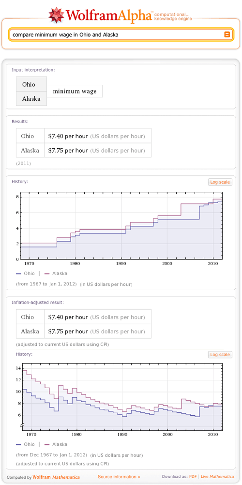
Wolfram|Alpha recently added information about the minimum wage in U.S. states (from 1967 through today) based on data from the U.S. Department of Labor. This means you can ask Wolfram|Alpha about simple historical facts, like the U.S. minimum wage in 1980, or perform simple analyses, like comparing the current minimum wage in Ohio and Alaska.
 9
9
As kids start to return to classes after the holidays, we’re happy to announce that Wolfram|Alpha has the ability to compute some interesting information about their school districts. You can now use Wolfram|Alpha to analyze and compare data on student-teacher ratios, expenditures, revenues, and salaries in more than 18,000 public school districts in the United States.
Let’s start with an example on the West Coast: Seattle Public Schools is one of the larger districts in the country, with over 100 schools and more than 45,000 students. The student-teacher ratio is 18:1, and if you scroll down you’ll see that total expenditures are about $14,000 per student per year.
 1
1
A little over two months ago, we announced the addition of U.S. retail sales data to Wolfram|Alpha. With the holiday season upon us—and a great deal of attention focused on how current economic conditions will affect consumer spending this year—we thought it might be good to remind users of this functionality.
Retail sales data from the U.S. Department of Commerce always lags a few months behind the present, so the latest available data is for September 2010 (Wolfram|Alpha automatically picks up new data each month when it is released, usually around the 15th). But looking at sales categories that are highly seasonal, like jewelry stores, you can still observe some clear trends in the sales “spike” that occurs each December, with holiday-season sales way down in 2008, but recovering slightly last year:

Or choose “last 2 years” from the drop-down menu in the History pod to zoom in on the action a bit more and see how more recent trends match up against previous years:
You can also ask Wolfram|Alpha to analyze retail sales in a given category over any arbitrary date range for which data exists. Try asking about “U.S. clothing retail sales September 2005-September 2010” and you’ll get a result with the mean, maximum, and minimum value of retail sales over that time period—plus a zoomed-in view of retail sales in every category over those dates: More »
 8
8
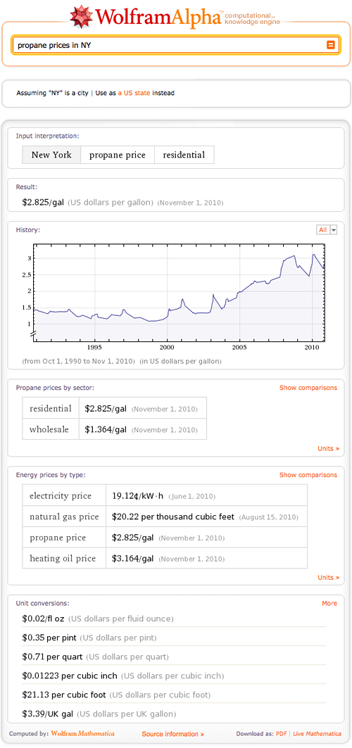
As temperatures start falling across the U.S., many of us are looking more closely at our home heating and energy bills, wondering how much they might go up this winter. Wolfram|Alpha can’t yet predict the future, but now it can help you explore historical and recent energy-price trends in most U.S. states, thanks to data from the U.S. Energy Information Administration (EIA).
Ask Wolfram|Alpha about “heating oil prices in New York”, for example, and you’ll see that as of November 1, the statewide average price was about $3 per gallon—slightly higher than at the start of last winter, but quite a bit below the peak in late winter of 2008. Propane prices are also higher than a year ago, and you can also see that prices climbed dramatically over the course of last winter. You can keep checking back over the course of the season to see which way prices are trending in your state.
(Note that the jagged appearance of heating oil and propane plots is due to the fact that prices are only reported for part of the year; these prices are also reported for only about 20, mostly northern, U.S. states.)
You can also ask Wolfram|Alpha about natural gas and electricity prices. The EIA keeps these figures less up to date than figures for heating oil and propane, but you can clearly see long-term price trends and seasonal fluctuations for both of them. More »
 4
4
When we talk on this blog about “making knowledge computable”, the knowledge in question is often mathematical or statistical in nature. But that’s not the only knowledge Wolfram|Alpha can compute. We’ve always had a solid backbone of dictionary-style information about words, but we’ve been steadily adding new features to that traditional output. Some of it should be quite useful, some of it is just for fun, and much of it takes advantage of Wolfram|Alpha’s ability to mash up algorithms and data from a wide variety of knowledge domains.
To celebrate National Dictionary Day (October 16)—which honors Noah Webster, often regarded as “the father of the modern dictionary”—you might like to take advantage of this classic word widget, which provides quick access to some of the more traditional areas of Wolfram|Alpha’s lexicographical data: definitions, pronunciations, synonyms, and more for most English words.
Or grab the next widget if you want to play around with a few of the “fun” features we’ve added, including the ability to compute anagrams and convert words to telephone keypad digits. More »
 8
8
Renowned physicist Enrico Fermi’s name is synonymous with a type of estimation problem often illustrated by the classic question, “How many piano tuners are there in Chicago?” Finding a “Fermi estimate” of this number would typically involve multiplying a series of rough estimates, such as the population of Chicago, an approximate number of households owning pianos, the frequency with which a typical piano might be tuned, and so on. It’s unlikely that anyone would arrive at a precise, correct answer through this method, but a Fermi estimate should at least be able to generate an answer that is approximately the right order of magnitude.
A Fermi estimate usually seeks to measure a quantity that would be extremely difficult, if not impossible, to actually measure. “Piano tuners in Chicago” may have fallen into that category several decades ago, but as Wolfram|Alpha can now demonstrate, things have changed:
We recently overhauled our data on jobs and salaries in the United States, adding Bureau of Labor Statistics (BLS) data on more than 800 detailed occupations at the national, state, and metropolitan area levels. Which means Wolfram|Alpha can’t quite get you to an exact measurement of the number of piano tuners in Chicago (and presumably, many of them must at least dabble in other instruments), but it can come surprisingly close.
Wolfram|Alpha can also compute a number of interesting statistics that aren’t obvious from the source data, such as the fact that Chicago has quite a high density of musical instrument tuners and repairers—roughly 2.3 times the national average workforce fraction for this occupation—and that their median wage is roughly 1.3 times the national average. And it can also provide helpful context for any occupation, computing employment and wage information for related jobs and sub-specialties, according to BLS classifications.
You can also perform all kinds of interesting comparisons, of course: try asking Wolfram|Alpha to “compare producers and actors employment in California”, for example, or “garbage collectors vs waiters salaries in New York City”. Or if you’re contemplating a cross-country move, you might be interested to see a comparison between “computer programmers salaries in Seattle vs Philadelphia”.
And if you need to access salary and job-related data often, you can create your own Wolfram|Alpha Widgets tailored for specific jobs and regions. You can easily customize widgets, like the one below, and embed them in your website and share with your social networks.
 5
5
Recently, as students head back to school, we’ve written quite a bit about Wolfram|Alpha’s mathematics capabilities. But those of you who don’t have quite as much interest in, say, transfinite cardinal arithmetic, can rest assured that we haven’t stopped adding more general pop culture data to the system.
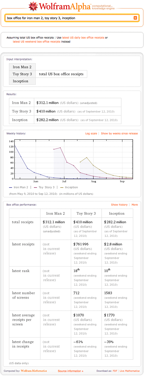
One of our latest features is detailed U.S. box office data, with information on total, weekend, and in many cases even daily receipts for motion pictures. So if you want to see how a recently released film is doing in theaters, just ask about its box office totals. For example, try “eat pray love box office“. Or maybe you’d like to look back and compare some of the summer’s biggest blockbusters. Try “box office for iron man 2, toy story 3, inception” for a quick comparison; to make it even easier to compare several films released on different dates, click the “Show by weeks since release” button to align the movies’ start dates. In this case, it’s easy to see that although Iron Man 2 had the strongest opening of the three, its revenue also fell off more steeply in the following weeks.
You’re not limited to films released this summer, of course—if you’re a fan of director Christopher Nolan’s work, you might like to see how well Inception compares to his previous directorial effort, The Dark Knight. Or maybe you’d like to compare two other cinematic heavy-hitters to see which one held the #1 box office rank longer. More »


